 WXUI
WXUI演示APP
推荐浏览器扫码安装
演示APP
组件类型:WxNavbarComponentPublicInstance
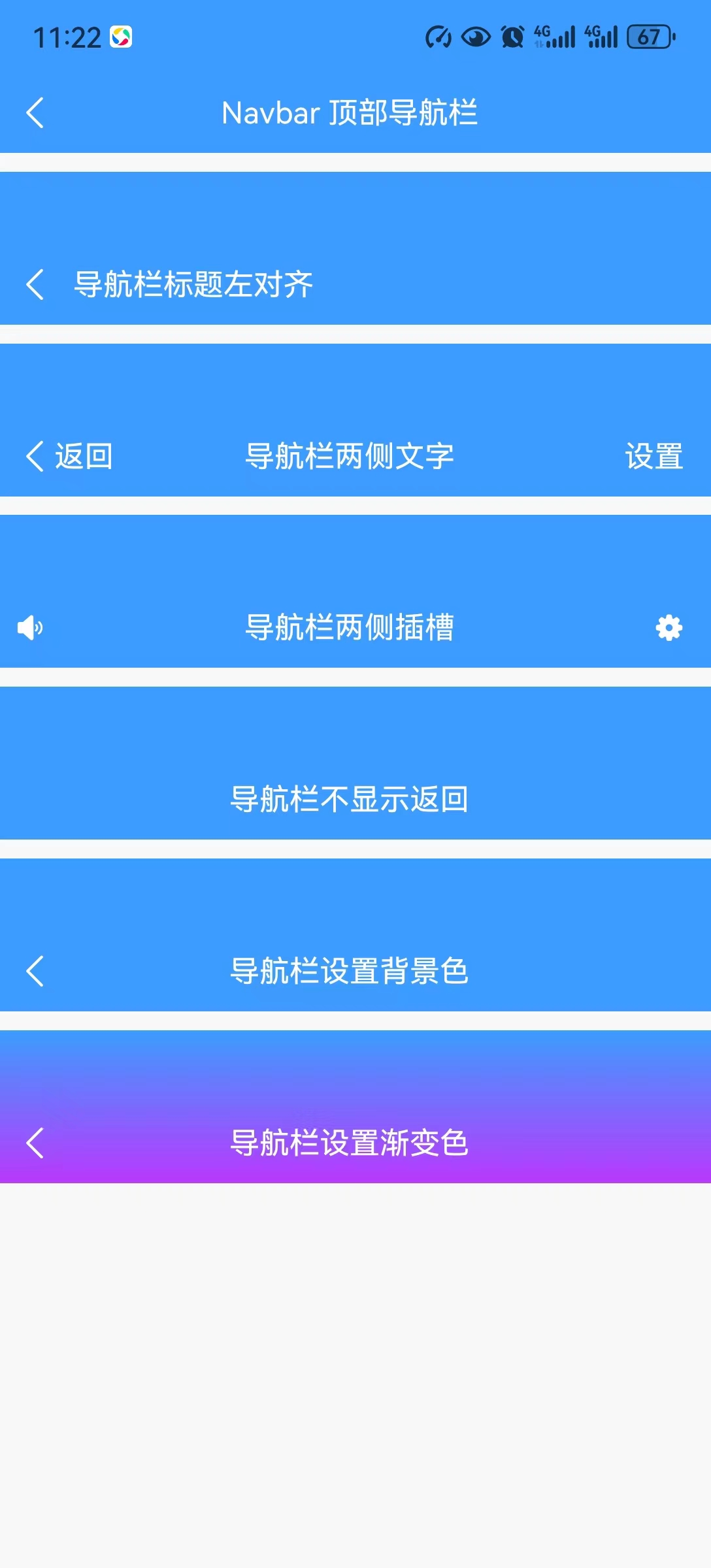
为页面提供导航功能,常用于页面顶部。
| Android uni-app-x | iOS uni-app-x | web | 小程序 |
|---|---|---|---|
| √ | × | √ | × |
需要将 pages.json 里对应页面的 style 或 globalStyle 里设置 "navigationStyle": "custom",关闭原生导航栏。 然后使用如下页面结构:
<template>
	<wx-navbar title="Navbar 顶部导航栏"></wx-navbar>
	<!-- #ifdef APP -->
	<scroll-view style="flex:1">
	<!-- #endif -->

	<!-- #ifdef APP -->
	</scroll-view>
	<!-- #endif -->
</template>通过 isBack 属性来设置导航栏是否返回上级
<wx-navbar title="导航栏标题左对齐" :isBack="true"></wx-navbar>通过 isLeft 属性来设置导航栏标题左对齐
<wx-navbar title="导航栏标题左对齐" :isLeft="true"></wx-navbar>通过 leftText 和 rightText 属性来设置导航栏左右侧文字
<wx-navbar title="导航栏左右侧文字" leftText="返回" rightText="设置"></wx-navbar>可以通过插槽自定义导航栏两侧和标题的内容。
left 左侧插槽title 标题插槽right 右侧插槽<wx-navbar title="Navbar 顶部导航栏">
<template #left>
<wx-icon color="#fff" name="volume-fill"></wx-icon>
</template>
<template #title>
<text>我是标题插槽</text>
</template>
<template #right>
<wx-icon color="#fff" name="setting-fill"></wx-icon>
</template>
</wx-navbar>通过 bgColors 属性来设置导航栏背景色,支持渐变色。
bgColors 属性不同的数量会有以下效果:
bgColors 默认为 #fffbgColors 背景为填写的颜色bgColors 则会从上往下实现多个颜色渐变效果<wx-navbar title="Navbar 顶部导航栏" :bgColors="['#3c9cff', '#ba38fe']"></wx-navbar>| 名称 | 类型 | 默认值 | 描述 |
|---|---|---|---|
| title | string | - | 导航栏标题 |
| color | string | wxConfig.config.theme.main | 文字颜色 |
| size | number | 16 | 导航栏标题大小 |
| bgColors | string[] | [] | 导航栏背景色 |
| titleStyle | string[] | [] | 导航栏标题自定义样式 |
| leftText | n | - | 左侧文字 |
| rightText | n | - | 右侧文字 |
| borderColor | string | wxConfig.theme.border | 边框背景色 |
| fixed 1.0.3 | boolean | true | 导航栏是否固定显示 |
| isLeft | boolean | false | 导航栏标题是否左对齐 |
| isBack | boolean | true | 导航栏是否显示返回 |
| isBorder | boolean | false | 导航栏是否显示边框 |
| customStyle | Array<any> | - | 自定义样式 |
| customClass | Array<any> | - | 自定义class |
| 名称 | 类型 | 默认值 | 描述 |
|---|---|---|---|
| @leftClick | () => void | - | 点击左侧区域触发 |
| @rightClick | () => void | - | 点击右侧区域触发 |
| 插槽名称 | 描述 |
|---|---|
| left | 左侧插槽 |
| title | 标题内容插槽 |
| right | 右侧插槽 |